DonAid
Rebooted and revamped
Check it out
Ueno worked with Checkout.com to reboot
their brand and revamp their online
presence.
Client
In ten years Checkout.com has gone from
bootstrapped startup to leader in online
payments, providing global end-to-end
services to thousands of companies,
including Samsung, Transferwise, Virgin
and Adidas.
Brief
Coinciding with its launch in the US,
Checkout.com wanted to rethink its brand
and online presence, making it more
visually arresting and coherent. The
company also wanted to set itself apart
from its B2B competitors with a more
friendly and human approach.
Solution
We worked closely with the Checkout.com
team to take their already established
brand strategy to its logical conclusion,
rebooting the visual identity, shaping their
tone and voice, and designing a new
website. Work began in November 2017, and
ended with the launch of the new website
in February 2018.
Our role
Branding, strategy, website design, art
direction, content strategy.
Time for a reboot
Upgrading the brand
After three years of rapid growth, Checkout.com’s
branding no longer reflected the stature of the
company. Following an already existing brand strategy,
tweaked and translated here and there, we reworked
and refined, overhauling the logo and developing a
more sophisticated color palette.

Letters of recommendation
New typefaces
In a field that’s not generally very touchy-feely,
Checkout.com stands out for being attentive to the
human and the personal. We wanted their new
typefaces to reflect those values.


GT Super Display Bold
GT Super Display Bold


The human typeface of capitalism.
GT Super Display is a brand new typeface from our friends at
Grilli Type. Contemporary and elegant, it looks great in large size
copy in various formats and applications, online and offline.
All in the family
Icons for every occasion
We created a set of 22 new icons (some of them animated)
for Checkout.com to use in various contexts. Closely
related to the logo, they all derive from it elements like
weight, shapes, geometry and color.


“
We created an icon system based on the logo and
its line style. The system includes accents of green
color that functions as the highlights of the
concept.”

Andrea Mata
Designer
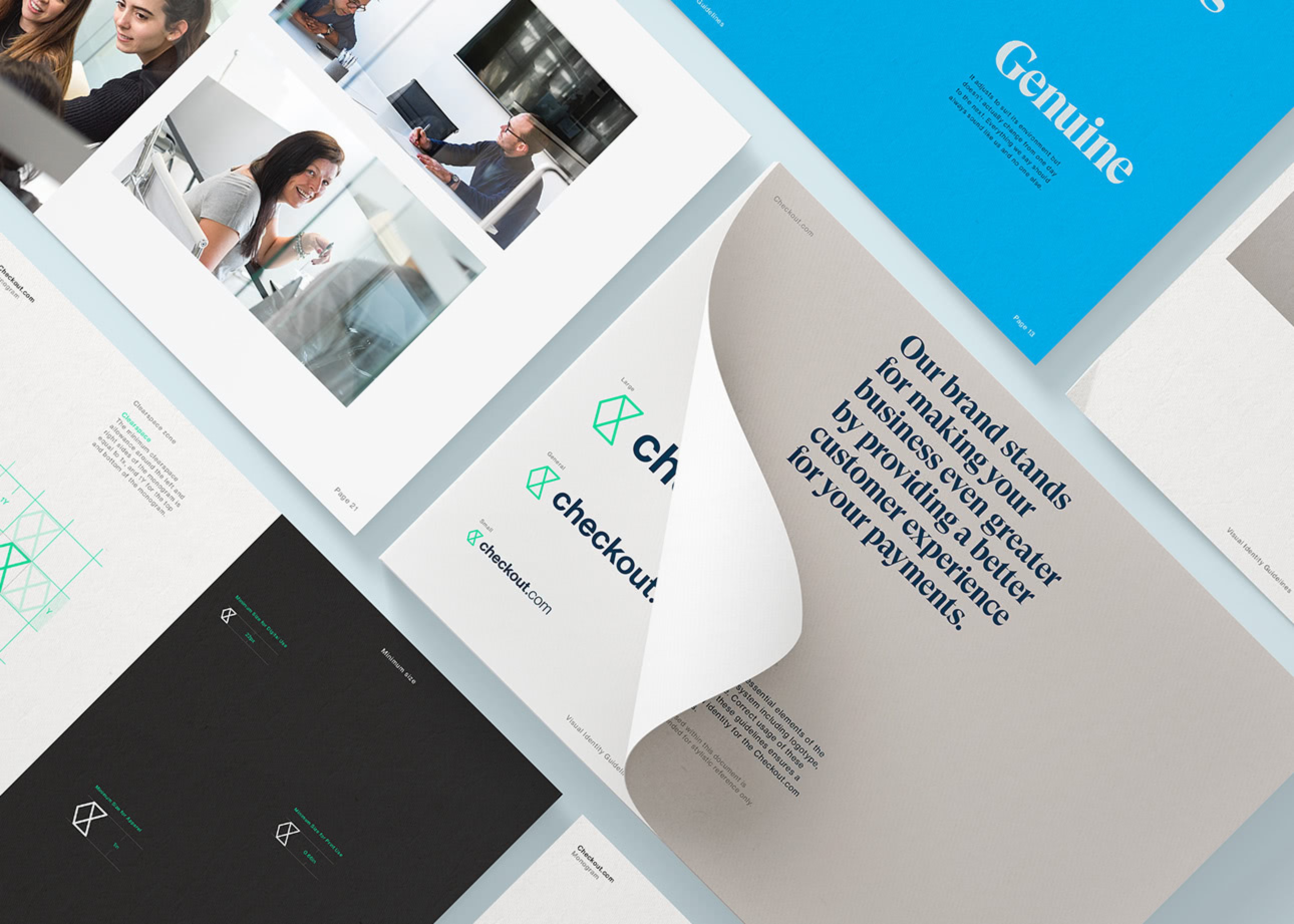
By the book
Visual identity guidelines
The brand bible is the final word on Checkout.com’s
identity: logotype, typography, color palette, photography,
illustration, tone of voice, and more. It comes with
detailed instructions on how to use these elements in a
variety of contexts.